The Daily Edited Melbourne Flagship
Pattern Studio
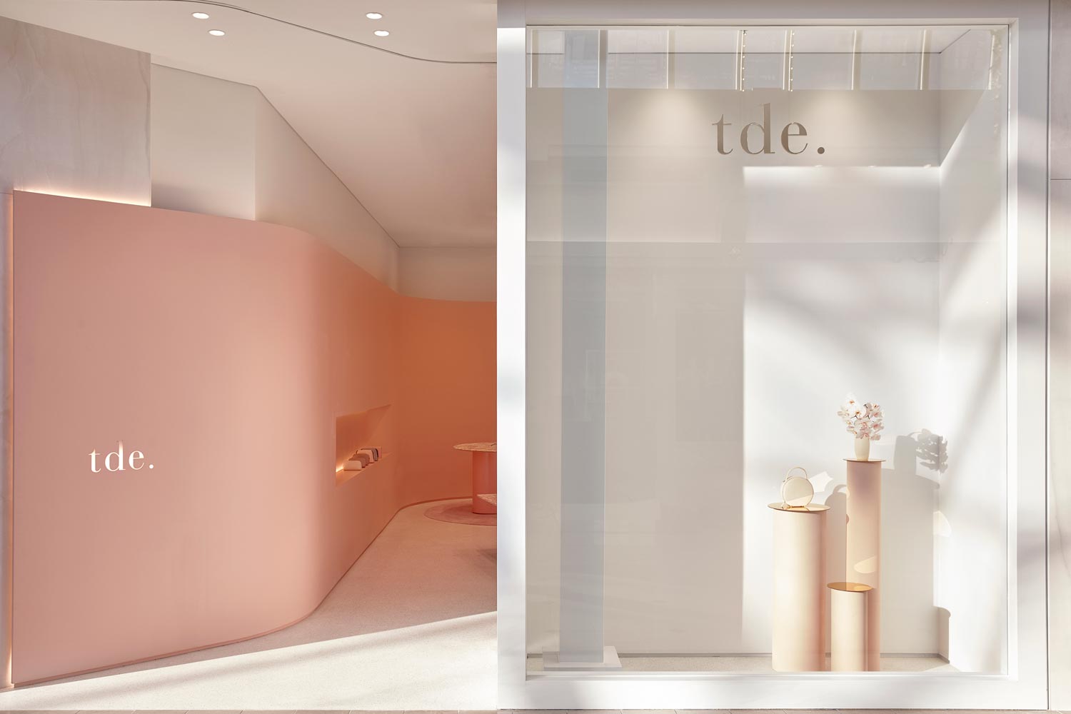
For Pattern Studio, The Daily Edited was an exciting client because the brand is so young – thus there is still a lot of creative freedom in terms of design. With no set ‘brand design guidelines’, it was agreed that the store should feel young and cool, yet sophisticated and refined. The store is a celebration of the brand’s core values: luxury, indulgence, beauty and splendour.
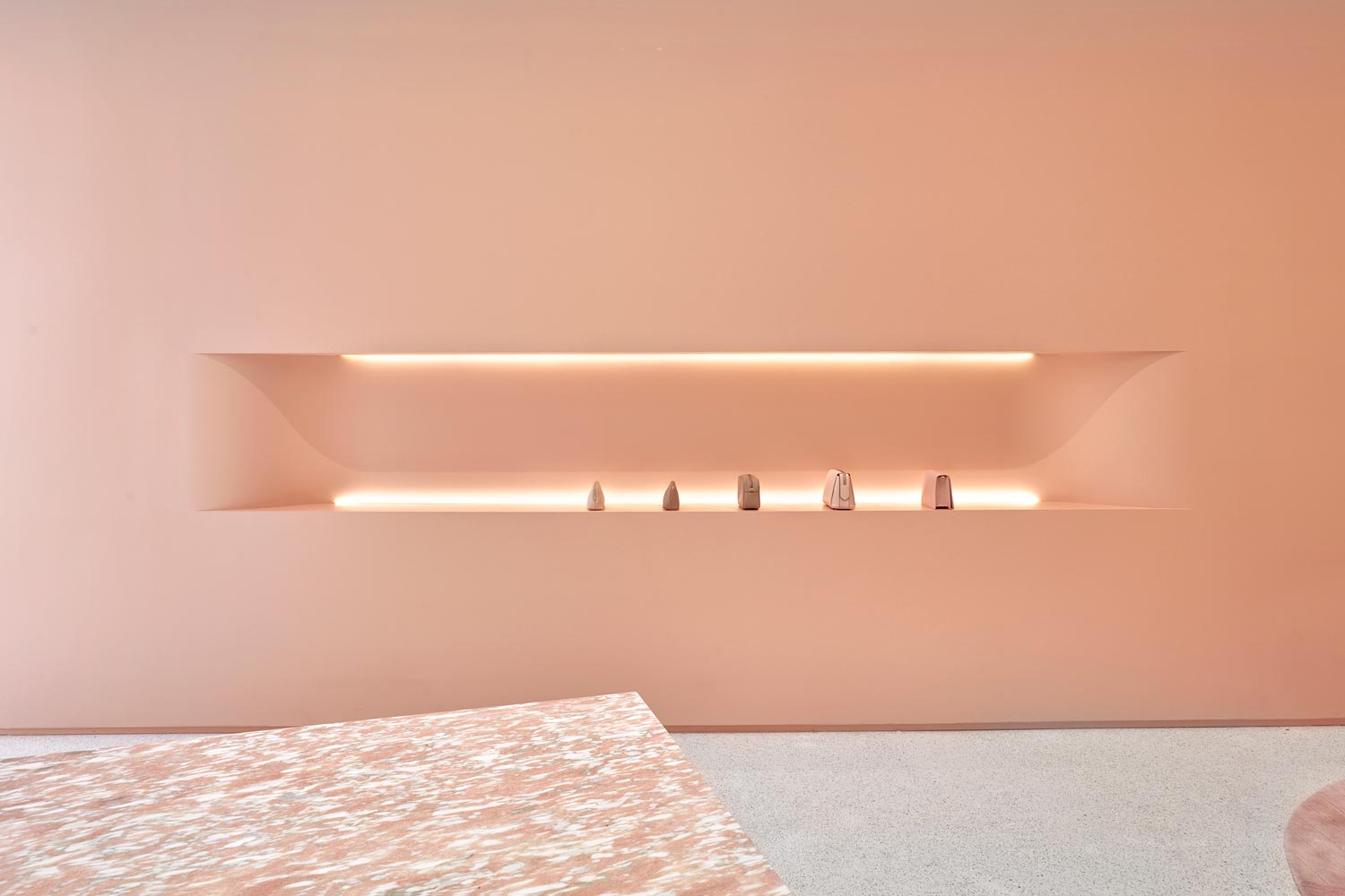
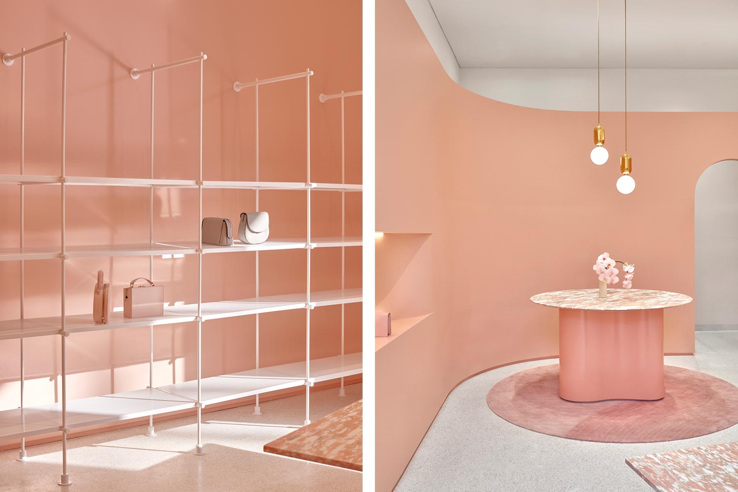
In response to the store’s modest floor area (60 square metres) decorative, ornamental elements were stripped away leaving a few key design pieces to stand comfortably and confidently as focal points within the space. The volume of the store is accentuated by an illuminated datum line that creates a greater sense of height and spaciousness. Custom-designed joinery elements including a natural stone table and point of sale bench take pride of place and double as precious, covetable objects.
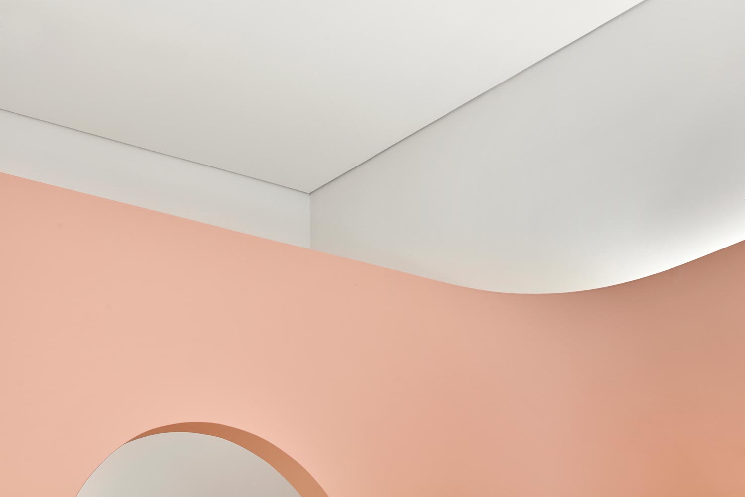
Themes including rapidly advancing technology and the intangible qualities of e-commerce were a source of inspiration, influencing the forms and detailing throughout the interior. The design includes a subtle nod to space-age, futuristic aesthetics; soft light emits from behind the curvaceous walls and integrated joinery units. A sweeping curve wraps the interior from the entry in and around the four walls of the store. A reductive material palette including Norwegian rose marble, white terrazzo, and terracotta-tinged pink feels feminine but not fussy. While pink is undoubtedly the hero, the aesthetic leans toward a refined kind of grown-up cool.
There were three objectives for the project. The first was to elevate the perceived value of the product by creating a high-end, luxurious retail space. Customers enjoy the experience of shopping in a high-quality space while the price point is still accessible. The second was to increase customer engagement by creating a highly visually appealing store. The photogenic, social-media friendly design appeals to customers who willingly publish photos of commercial spaces to social media, generating brand interest as well as a desire to visit this ‘destination’ store as if it were an exhibition in a gallery. The third objective was to capture the attention of a new consumer market. The store aimed to appeal to more discerning consumers, by presenting the brand in a more sophisticated light.
The combination of a young brand (less than three years) and a young design practice (less than two years) shows that a fresh set of ideas paired with grit and determination can yield exciting and novel outcomes.
Photography: Sean Fennessey


