Gravity Tower
Plus Architecture
Gravity Tower is located on a small site in a fast-growing residential precinct in South Melbourne. The client required a design proposal that utilised the site to its greatest capacity. Planning regulations at the time required setbacks on all sides to account for future development of the adjacent sites. Due to the compact site area of just 120sqm, these setbacks would leave a project of any height unfeasible, making it impossible to deliver a viable yield.
To overcome this, Plus Architecture researched the site and the proposed surrounding developments, and successfully argued for a revision of site setback requirements to allow the project to be built to boundary on the rear boundary. The successful arguing of this case allowed for a financially viable project to proceed to planning, gain approval, and become the first project built in Melbourne’s Fishermans Bend precinct.
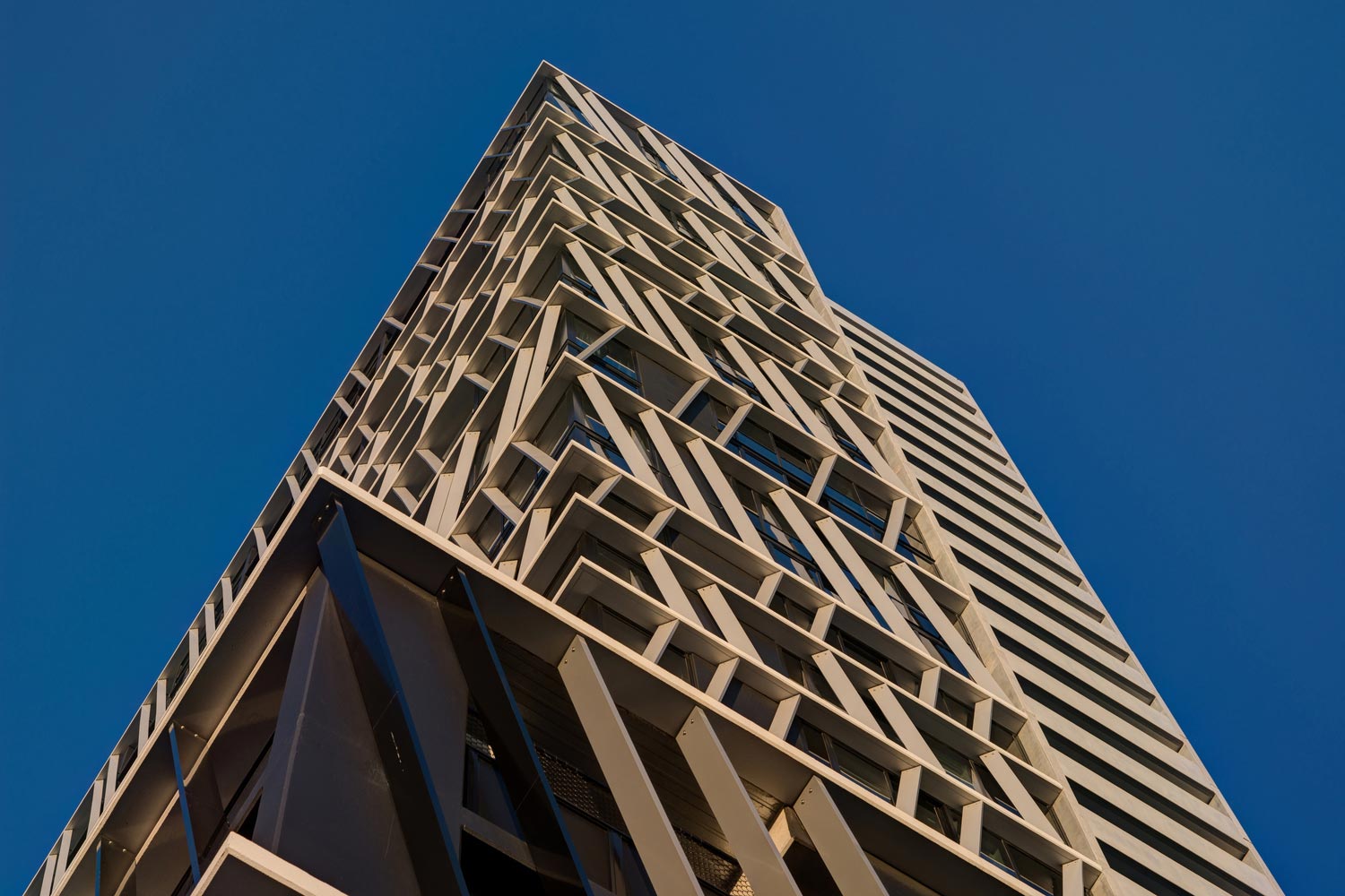
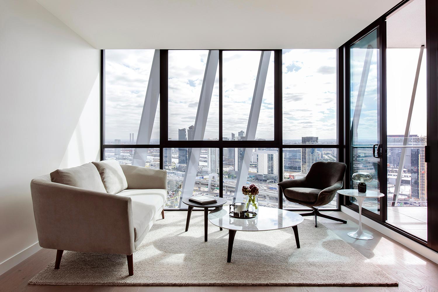
The client also requested a 70-metre-tall tower offering amazing city and bay views, but that was sheltered from the hot western sun. To take advantage of the stunning views, floor-to-ceiling glazing was specified for all apartments. To protect apartments from the sun, the architects designed a chevron-patterned system of steel louvres, angled to provide maximum protection from the sun while still opening up apartments to views.
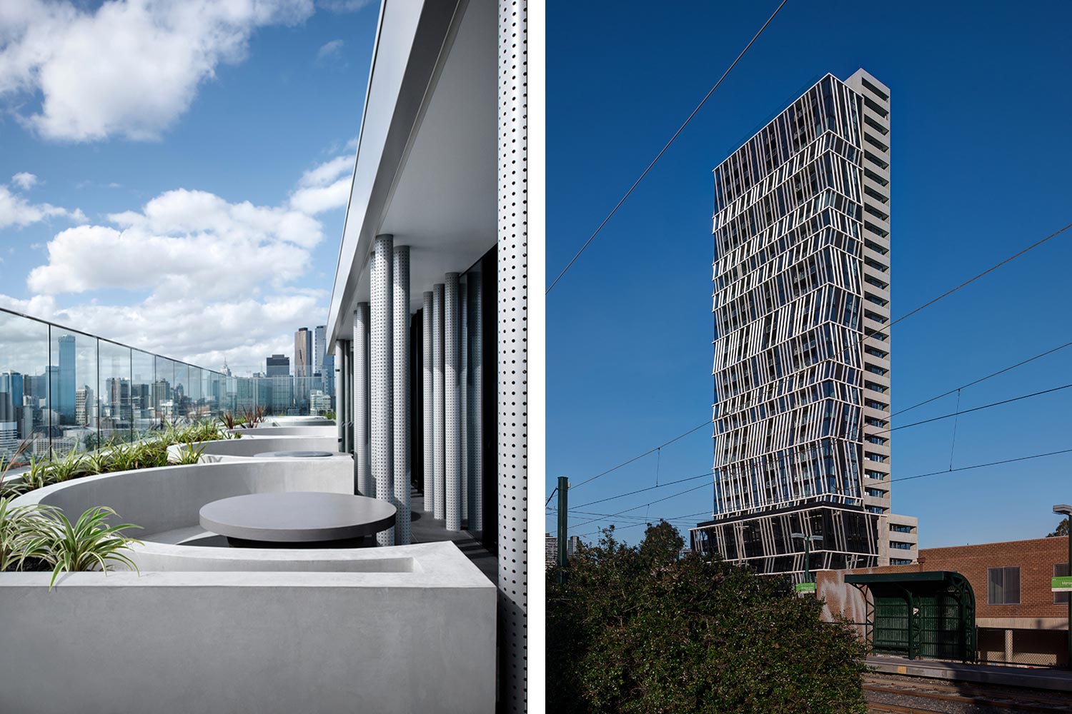
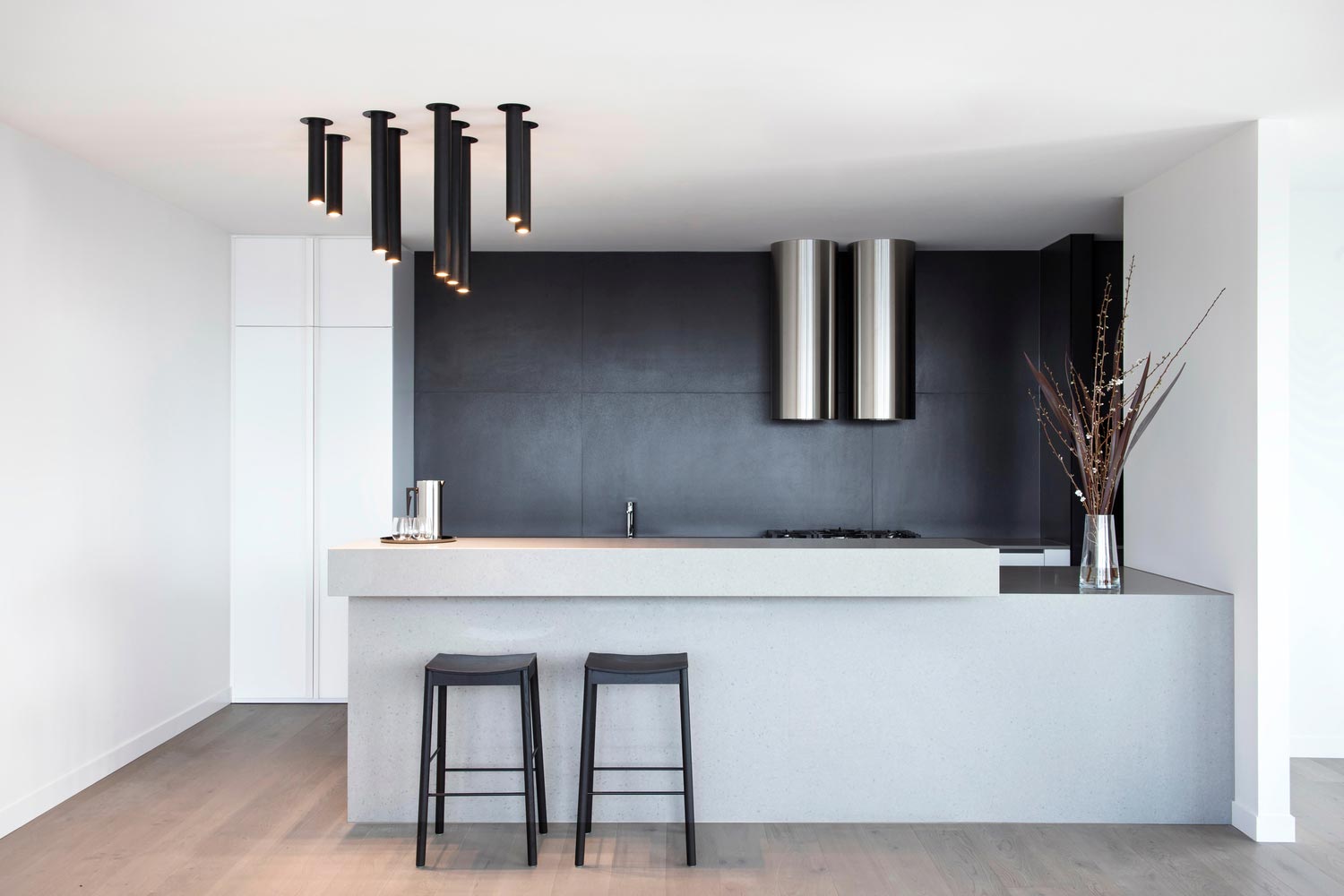
Gravity Tower’s apartments are aimed at both investors and owner-occupiers, providing affordable options for entry into the housing market as well as more roomy two-bedroom apartments for small families. All are afforded excellent light and access to outdoor spaces through balconies and the resident-only rooftop dining/spa/cinema space.
The six-storey podium creates a street wall, with the tower mass set back from the corner boundaries. Tower splits reduce the visual mass, creating opportunities for further tower articulation. Glass corners create a ‘lantern design’ and a beacon between precincts, guiding the transition from CBD to Fishermans Bend. Because of strict flood regulations, the building was designed with no basement-level parking and a raised ground floor. The challenge was designing a welcoming ground level for retail and hospitality spaces, which were raised 1.5 metres above street level.
The design approach for this development was strongly informed by both its present day and future context and the potential developments that are expected to neighbour it. Today the proposal marks the beginning of a revitalisation of a post-industrial landscape, and the design captures the optimism and vision of this new part of Melbourne. The site sits on the cusp of two major precincts and as such the design will be seen ‘in the round’. The language of the lantern has been chosen to mark this significant confluence of space and strategic planning policy.
Photography: Jaime Diaz-Berrio